Preparing Effective Slide Presentations
The following slide preparation tips are provided to help speakers prepare effective and readable presentations.

Each slide should be designed to be concise, uncluttered, and readable from a distance. Include only key words and phrases for visual reinforcement.
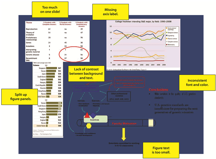
| Common Presentation Issues | Suggested Fix |
| Too much text | Can it be said instead of written? Is there a visual that can convey the same information? Use no more than six lines per slide, with each line containing no more than six words. |
| Too much information per slide | Each slide should convey one main idea. The audience should be able to take in the visual in 20 seconds or less. Information relevant to another idea should be moved to another slide. Irrelevant details should be excluded altogether. |
| Small text | No text should be smaller than 24 pt, including text in an imported figure. If the figure text is not important, edit it out. |
| White or bright backgrounds | Use light (not white) text on a dark background to minimize visual fatigue. |
| Inconsistent fonts/colors/backgrounds | Use consistent fonts/colors/backgrounds to keep the focus on your science. |
| Absent labeling of graphical representations | Make sure each figure includes sufficient labeling for the audience to make sense of it, including axis labels for graphs. |
| Too many slides | Present only the ideas and science necessary to tell your story, not every experiment you have ever done. A 15-min presentation should have 10-12 slides. |
| Unnecessary animation | Animation should only be used to focus your audience’s attention. Revealing one lane of a gel at a time as you discuss an experiment is appropriate. Swirling in every figure is not. |
| Red/green heatmaps or other visuals | Remember that those who are red/green colorblind cannot interpret figures that rely on distinguishing red and green. Use blue and yellow instead. |
| Using whole multi-panel figures on one slide | Multi-paneled figures should be split up for readability and to minimize distraction. Also see “Too much information per slide”. |
| No storyline or narrative | Throwing experiments and data at an audience with no overarching narrative is a sure way to put people to sleep. Give your audience a story arc they can hold on to even if they miss the point of one of your experiments. |
| Presenting experiments strictly chronologically | Think about how to structure your talk so that an audience unfamiliar with your science will best grasp the ideas you are trying to convey. Chronological order may not be ideal. |
| Omitting the larger motivation for your work | Remember to state explicitly why your science is important and how it fits into a bigger picture. |
| Presenting unnecessary detail | Include only the details crucial to understanding your data. If someone is curious about your cell culture conditions, they will ask. |
| Turning away from the microphone | Face the audience and your microphone at all times when speaking. |
| Reading slides | There should not be enough text on your slides for you to read your presentation (see “Too much text”). Use the notes section of PowerPoint or bring notecards if you are afraid you will forget to say something important. |
| Flipping through slides too fast | This is usually tied to having too many slides, but also occurs when a speaker is nervous. Make a conscious effort to pause after advancing to your next slide. |
| Failing to orient the audience to a figure | You will lose the audience if you jump right into your data. Explain axes and any other relevant information about the figure before discussing the data it shows. |
| Running over into Q&A | Carefully time your presentation and cut slides if necessary. |
| Speaking unclearly (too fast, too low, mumbling) | Practice enunciating and remember to breathe while you are speaking. |
Font Guidelines
- The larger, the better. Remember, your slides must be readable from the back of the room. Content text should be no smaller than Verdana 24 point.
- Use Sans Serif fonts such as Arial, Tahoma, and Verdana for clarity.
- Do not use capitals except for occasional emphasis – they are harder to read than lowercase letters.
- Do not mix fonts unless it is for a good reason, e.g., presenting quotes.
Background Guidelines
- Use the same background on each slide.
- Do NOT use logo slides or institution-specific templates on any slides.
- Avoid white backgrounds – the white screen can be blinding in a dark room.
- Dark slides with light-colored text (not white) work best.
Color Guidelines
- Ideally, lettering should be light-colored on a dark-colored background.
- Reds and oranges are high-energy but can be difficult to focus on.
- Greens, blues, and browns are mellower, but not as attention-grabbing.
- Reds and greens can be difficult to distinguish for those who are colorblind.
Figure Guidelines
- Figures should be simple, with large lettering and clearly marked axes, etc.
- For figures created in charting programs and exported to a slide presentation program, be sure that the output fonts and line widths are legible once the image is scaled.
- If you have a complicated chart, it’s a good idea to add statistics directly onto the chart and to provide the details of the graph orally.
For more detailed guidance, visit http://www.ibiology.org/ibioseminars/techniques/susan-mcconnell-part-1.html. Note this video is approximately 45 minutes long.

